Friday, January 31, 2014

12 Tags of 2014, January


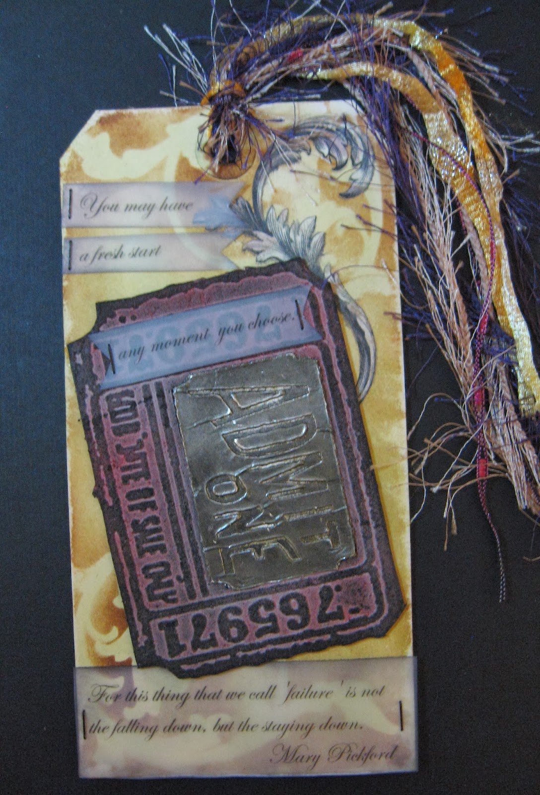
Was able to make a tag to participate in the 12 Tags of 2014 on timholtz.com.  My tag uses most of the same techniques as shown on that site. 

I used Idea-ology Mini Mask on large tag for scroll shape seen on top and bottom.

I used rub-ons for the fancy swirl in the upper right corner.

I printed the saying I found on the internet onto Vellum paper and cut out, attaching to tag with Tiny Attacher staples.  Saying is a quote from Mary Pickford (silent film star of years gone by and cofounder of United Artists studio) - "You may have a fresh start any moment you choose. For this thing we call 'failure' is not the falling down, but the staying down."  Thought that was a good thing to remember this new year.

I used a Tim Holtz Sizzix Alterations embossing folder for my ticket shape.  I embossed it on
Grungeboard, cut it out, and then also cut out the area that says Admit One using Exacto knife. I used foil tape on Grungeboard to emboss it a second time, cutting out the Admit One shape and substituting that when I glued tag down.

A tip for detailing: I colored my Tiny Attacher staples with black alcohol ink.

Sunday, December 15, 2013

12 Tags of 2013 - December

I was inspired to feature the bear, stars, and map paper by several Native American legends I have read that have to do with a how a bear comes down from the sky and returns to the sky.


I used the techniques as shown on Tim Holtz's blog.  Peace on Earth is my wish every year for Christmas, and I had this lovely word stamp from Inkadinkado.  I cut my own tag shape from Kraft Resist paper. After coloring the tag with Distress Inks, I coated the whole thing with Tsukineko Opalite Nordic Ice ink. It gave it a shimmer that unfortunately is not seen well in picture.  The polar bear is a shape I traced onto plastic with a stencil and used alcohol inks on the reverse to color, with Tim Holtz idea-ology Frosted Film on top.  The ice is a scrap piece of Frosted Film covered plastic with Glossy accents and Ranger Distress Rock Candy Dry Glitter sprinkled on top.  A Swarovski Aurora Borealis Crystal is under the words.  The yellow stars were applied by inking through a stencil.  Also, I used a brass washer and applied a technique I learned in Creative Chemistry 102.

I wasn't able to complete a tag each month this year, but I do want to give a try to going back to the pages for the months I missed out on to give some of those techniques a try as well.  Hopefully, there will be tags of 2014 and I will be giving that a try as well.

Thursday, October 10, 2013

Creative Chemistry Day 2 Technique Tags

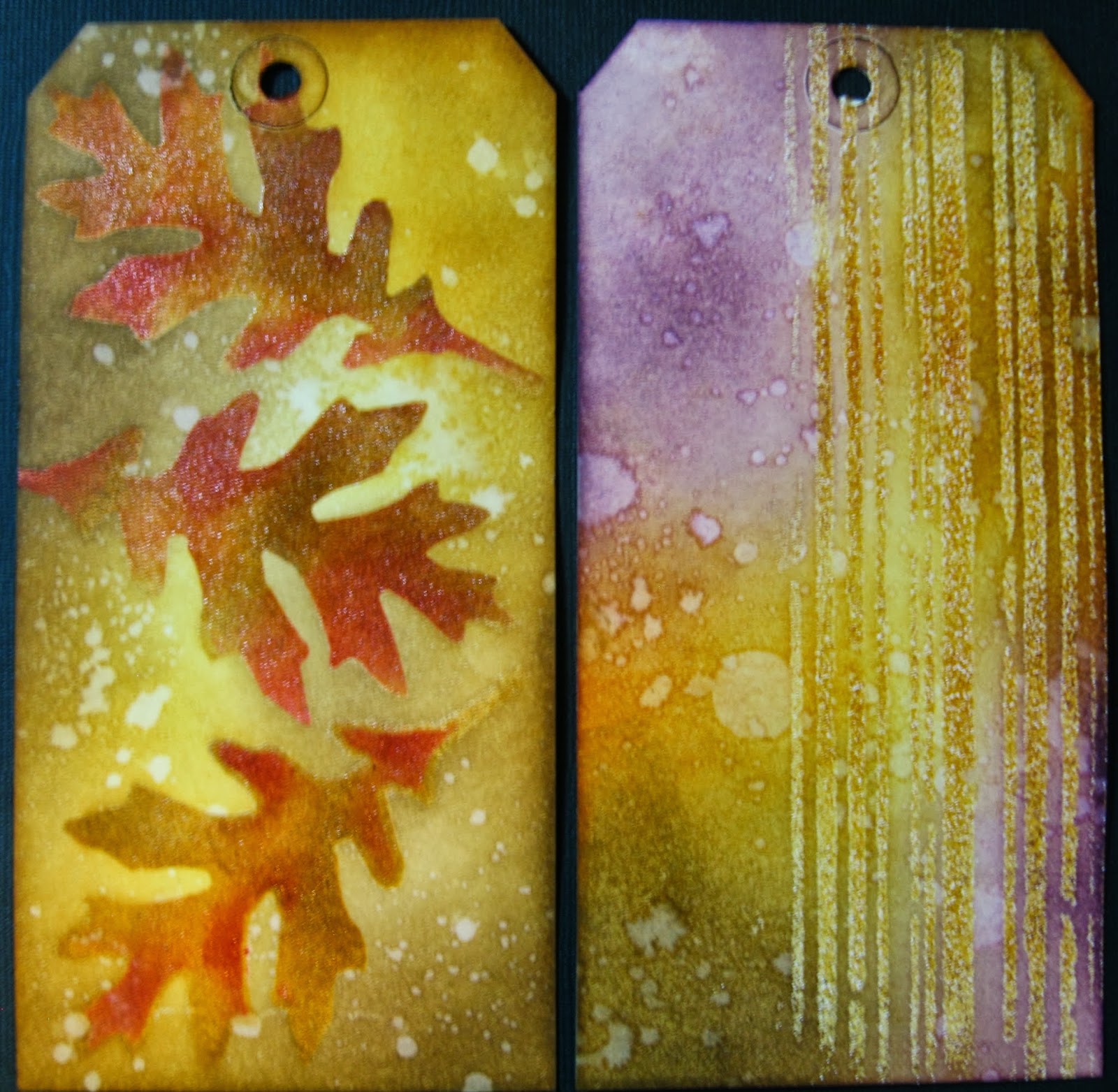
In real time it is Day 4 of Creative Chemistry and I am working on Day 2 techniques.  These are two tags I made with the Embossing through a stencil technique.

The one on the right is done with the Tim Holtz Stampers Anonymous stencil called Stripes. I used an embossing powder called Enamelware that I bought years ago.  It is a Ranger product and is a combination of clear embossing and white embossing, so it gives a flecked look like on enamelware tins.

The one on the left was made by using stencil material and the Sizzix Tim Holtz Tattered Leaves die cut to cut my own stencil.  In order to make the tag, I used the same leaf on that stencil to color and emboss three separate times. I inked the rest of the tag and splattered after I had embossed the leaf three times.


I will be adding the leaf one to my book ring of technique tags, but think I will save the striped one for use as a Halloween tag and get to decorating it and adding embellishments some time soon.

Thanks for looking!  Comments are always appreciated if you have the time.

Wednesday, October 9, 2013

Creative Chemistry 102 Industrial tag


This is my technique tag for the Industrial technique.  Awesome looking technique, but hard to photograph.  I have a detail closeup adjusted somewhat for the glare.


Really loved trying this one out.

I also had some small tags left over from a project I did before where I embossed tag and applied alcohol inks to give a metal look.  I took one of them and tried this technique over that to see what would happen.  Comparison shot below shows tag on left has this Industrial technique over alcohol inks and the one on the right is the original just embossed and alcohol inks applied.  I really am liking the one on left better as it looks even cooler and more like an aged metal. 


Hope to be getting to try day 2 techniques as in real time we are actually on day 3 already!  Lots and lots to learn and try out.

Thanks for looking!

Tuesday, October 8, 2013

Day 1 Creative Chemistry 102


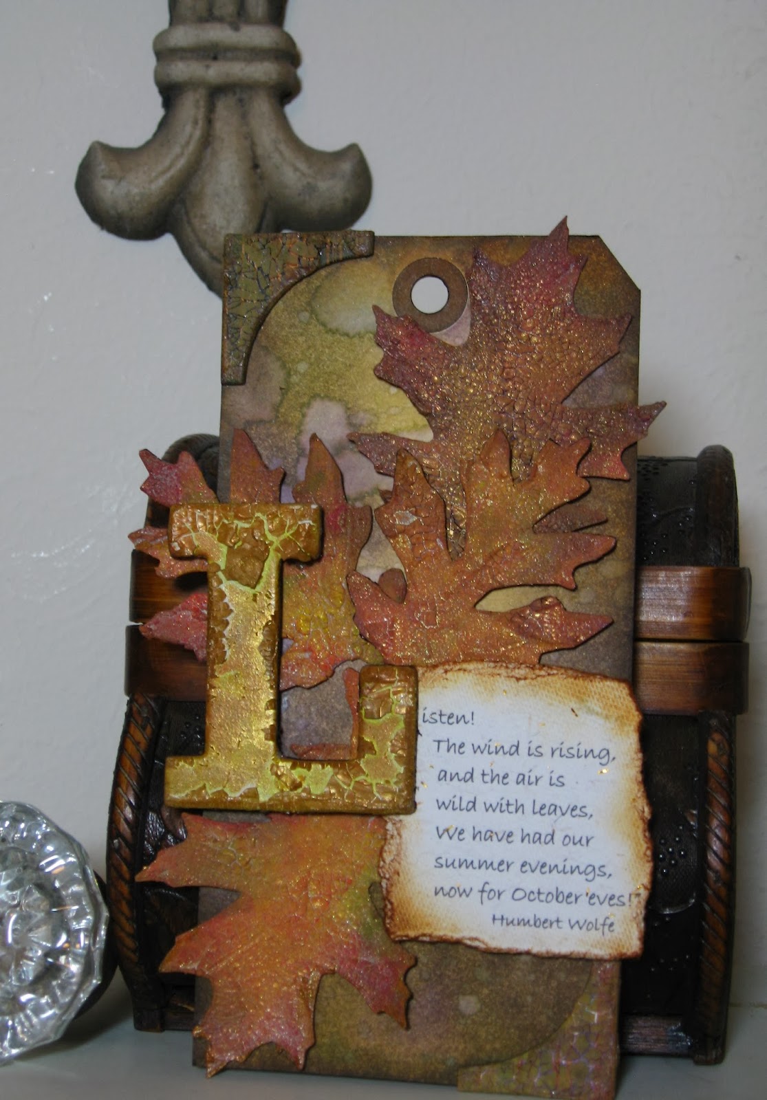
Loving all the great techniques I am learning in class!  The tags for class are mainly meant to be a reference point for the technique, but I got carried away with my idea for this one.  Love this particular look of Ranger Clear Rock Candy Crackle on die cut leaves.  I cut mine from Grunge paper and followed the technique for class.  Same technique is used on chipboard "L" and corner chipboard pieces.  The saying was one I found online and printed onto a handmade paper that has gold flecks embedded in it.  The line that inspired me was "the wind is wild with leaves".   I added a spritz of Wonderwash gold over both the chipboard "L" and the leaves.  The background tag is actually one I made in CC101 last year and was a "reject".  I think it fit nicely with this idea, so was able to use it. That just goes to show that something you made one day and was not your favorite may turn out to be just right for another project.  On to day two!!!

Wednesday, October 2, 2013

More Halloween Postcards and a Sparkly Transfer Technique

Here are the other two Halloween postcards I did for swap. 


This one is done using die-cuts and specialty papers.  The crow is a decoration from Martha Stewart's Halloween products.  The swirl is a Grunge board die cut that has been painted with Distress Picket Fence paint and then coated with Clear Distress Crackle paint.  The tattered roses on the bottom are Tim Holtz Ideaology Trimmings inked with Distress ink.

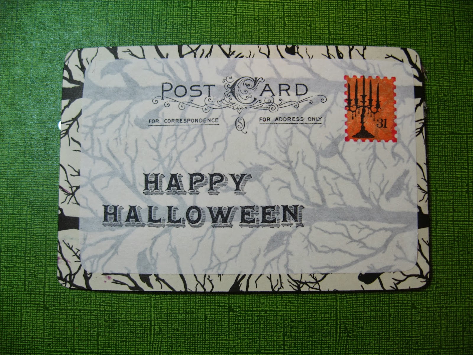
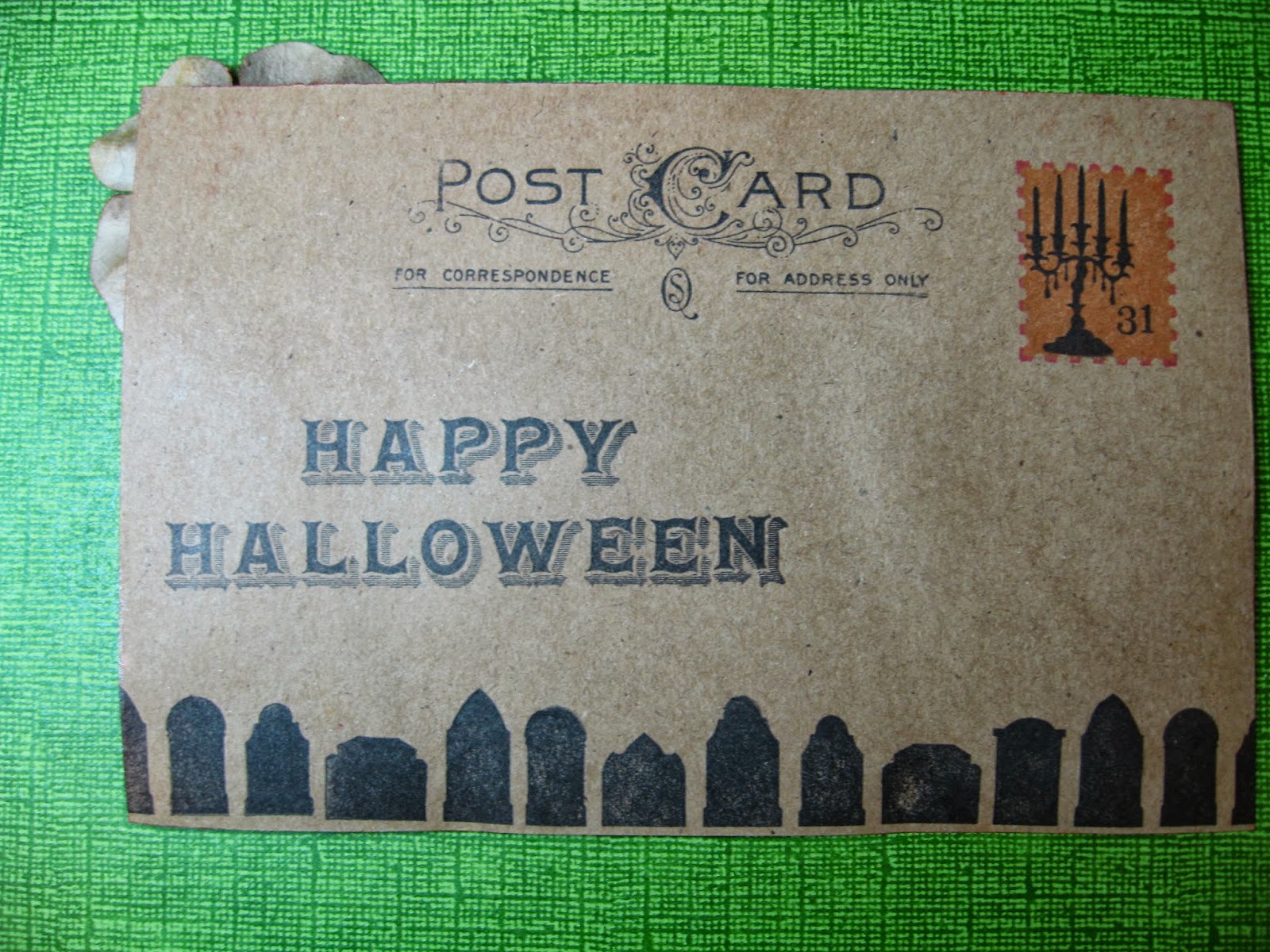
Here is the back of the card:


I stamped the Happy Halloween from Martha Stewart as well as the candelabra.  The postage stamp is a shadow stamp from Hero Arts and the "post card" words are the same as used on prior postcard.


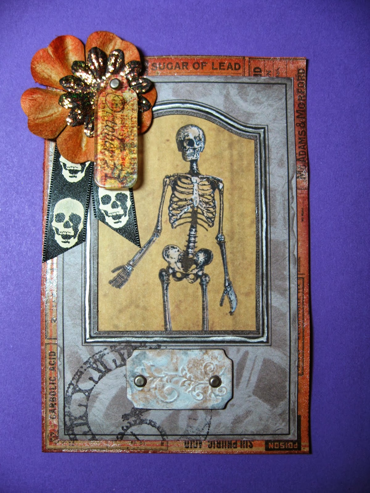
My final one for this swap uses lots of techniques including stenciling over a Graphic 45 die-cut frame from Times Nouveau collection with the new Tim Holtz Clockwork stencil, but I came up with one of my own that is going to be my favorite to use I think for a while:


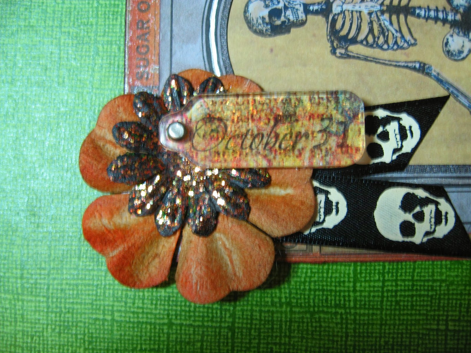
Here is a detail of the decoration in the corner:


I learned some terrific transfer techniques in the Technique Toolbox online class at Big Picture Classes.com from Claudine Hellmuth.  It was an excellent class and I highly recommend it if it becomes available again on their website.  My transfer technique began based on an idea from that class. 

First, I stamped the word "October" and the number 31 onto a pattern scrapbook paper using Ranger Black Archival Ink.  I used Glossy Accents to glue down a clear acrylic tag shape from the Idea-ology Fragments line onto the paper.  I let this dry.  I then used water and my fingers to rub off the paper.  This left my stamping and the pattern from the paper on the back of the Fragment.  From the front I now had a see-through Fragment that also had a design on it. It looked just fine like that and I could have used that...but, I like things that sparkle.

Years ago, this company Stubby Stampers.com had marvelous events locally where they would show all the latest and greatest products and some terrific new techniques.  I am talking before everything was so available everywhere on the internet.  They are still in business and have a great online website so check them out.  http://www.stubbystampers.com/  They used to show a technique where you stamp your image with permanent ink onto a clear plastic sheet and use glue and glitter on the reverse side to get some gorgeous glittery images that are smooth on the front. 

That idea, plus a paperweight my mother made years ago with Mica underneath a transfer image, gave me the idea to try Stickles glitter glue on the reverse side of my Fragment.

To do this, you have to flip the fragment over so the side you had glued down to the paper is facing you.  Spread the Stickles evenly over the entire back of the Fragment.  I used Stickles "Icicle".  You have to let it dry totally which takes a while (no using heat gun for this.) 

Meanwhile, I also coated a black paper flower with the same color Stickles.  The larger flower is a kraft color one that I inked with Distress.

Once your Fragment is totally dry, flip it over and admire the sparkles.  I tried several different colors of Stickles and find that the lightest colors work best for this.  I would stick with Crystal or Icicle if you are going to try it.  Sadly, glitter does not photograph very well, but it really looks pretty in person.

Here is the back of my Skeleton postcard: 


Give the Sparkly Transfer Technique a try and let me know if you like it!  I will be posting some more Halloween items as I have some ATC swaps I have joined as well.  Thanks for looking!


Wednesday, September 25, 2013

All Things Tim Yahoo Group Halloween Postcard Swap


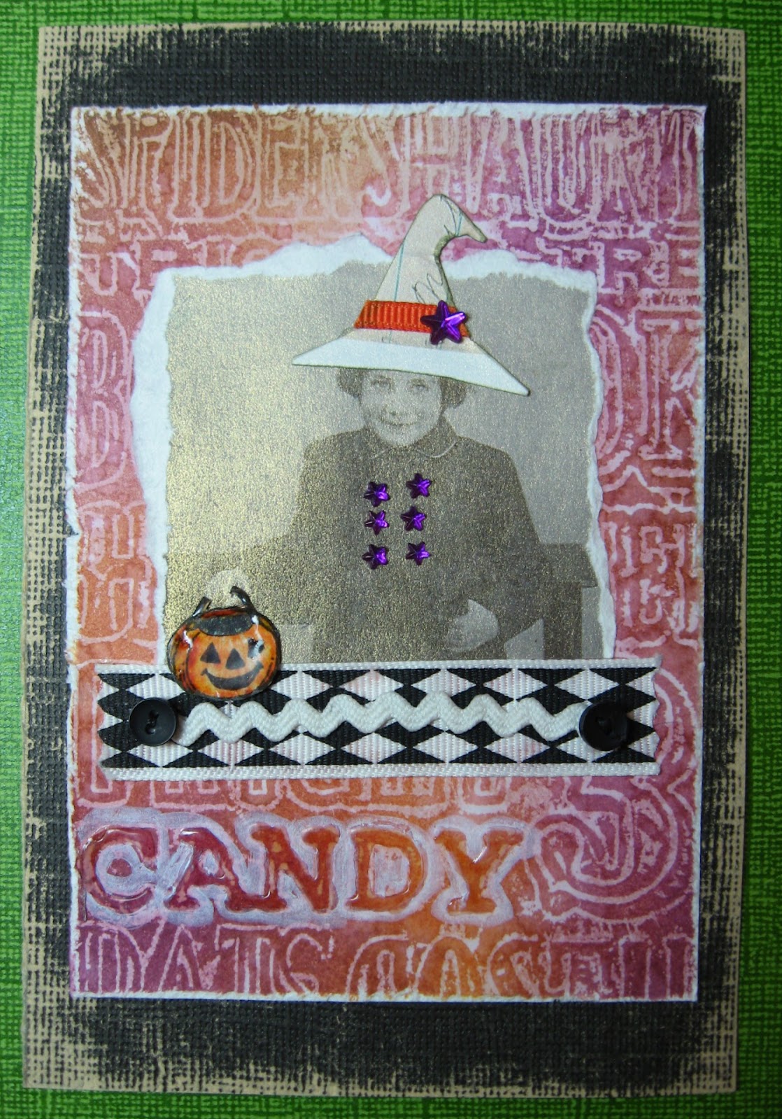
This is the first of 3 postcards I made for the ATT Yahoo Group Halloween Postcard Swap.  I will be posting the others on the 26th and 27th.  This is a card I actually started during the class I took online about collage techniques (taught by Claudine Hellmuth). 

Techniques to make this postcard include - The little girl is a digital image printed on an iridescent specialty paper which was torn to make interesting edge. Hat is cut from a paper with ribbon trim and rhinestone star.  Her buttons are also rhinestone stars. Pumpkin is stamped out on cardstock, trimmed, colored, and then covered with Ranger Glossy Accents. Trim underneath girl is ribbon, topped with glow-in-the-dark rick rack, sewn down with two black mini-buttons.  The word "candy" on background made with Tim Holtz Sizzix embossing folder and my wax paper resist technique is highlighted with Ranger Glossy Accents and then further highlighted by going around the letters using Picket Fence Distress Marker.


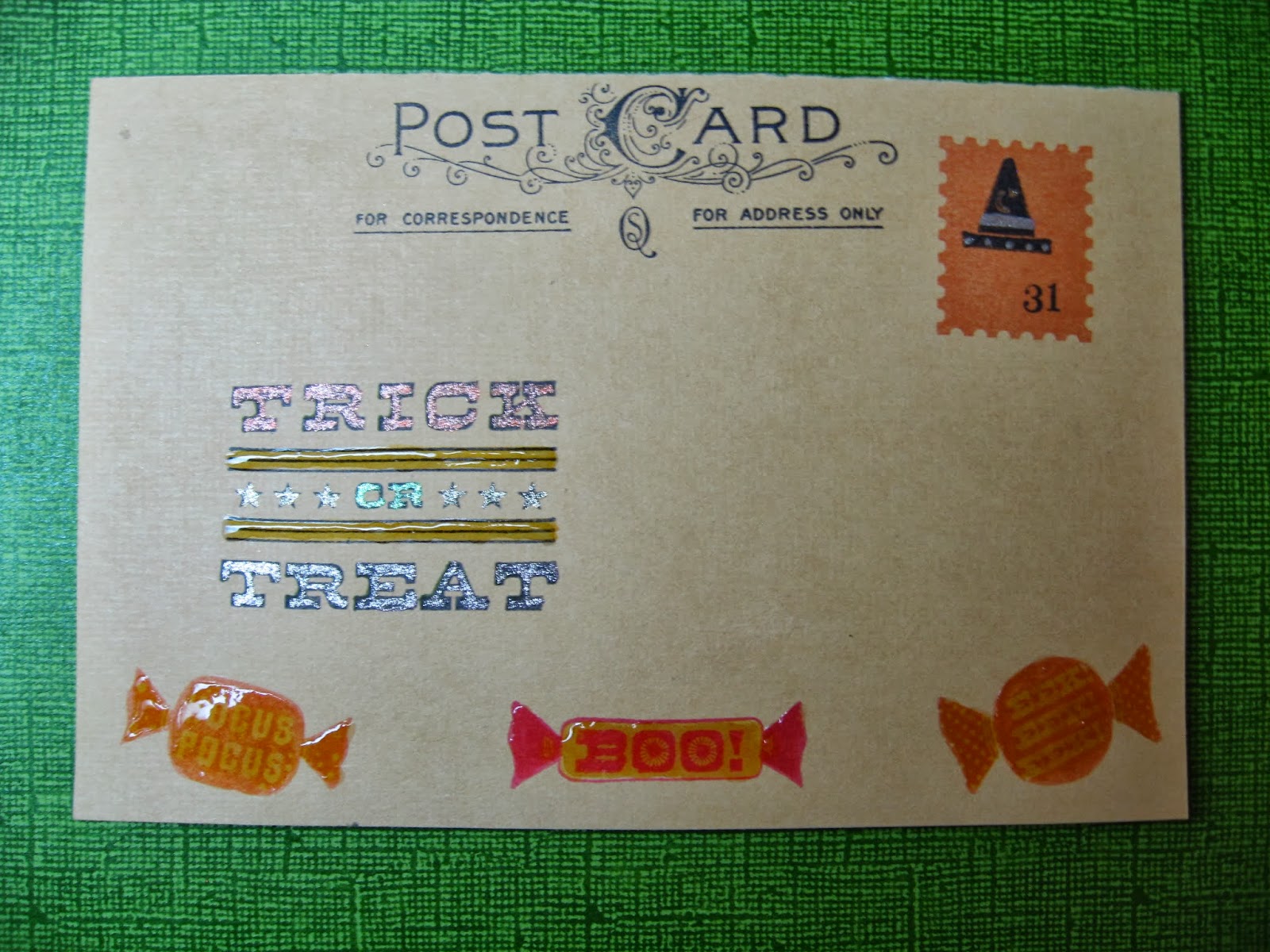
The back is made to look like a postcard using "Postcard" stamp from Tim Holtz Stampers Anonymous The Journey collection.  Candies are stamps from Martha Stewart Halloween collection and are covered in Ranger Glossy Accents.  The fake stamp is a Hero Arts Shadow stamp which I then stamped a little witch's hat from Studio G ($1 set) and some numbers.  The "Trick or Treat" is also from a Martha Stewart set and I highlighted it with Ranger Glossy Accents as well as some Sakura Gelly Roll glitter pens.  Here is a closeup of that...


Hope you enjoyed looking and come back to see my other two postcards in the next few day.  Thanks.