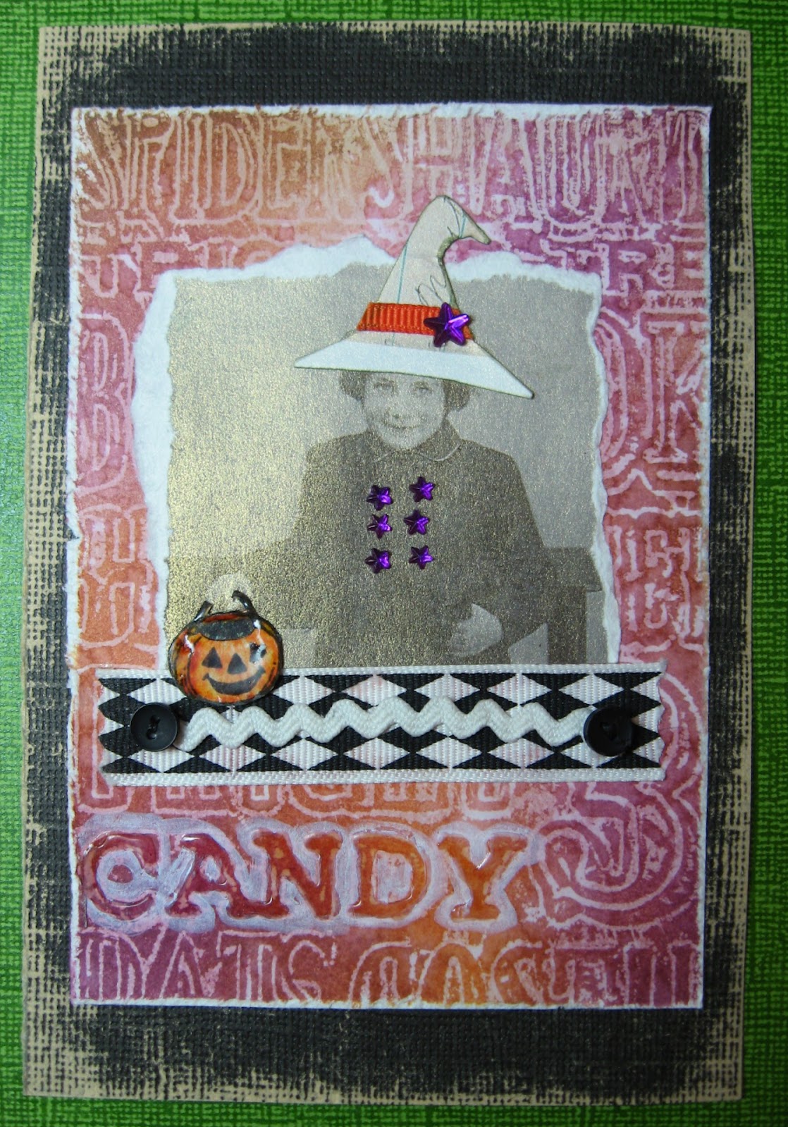
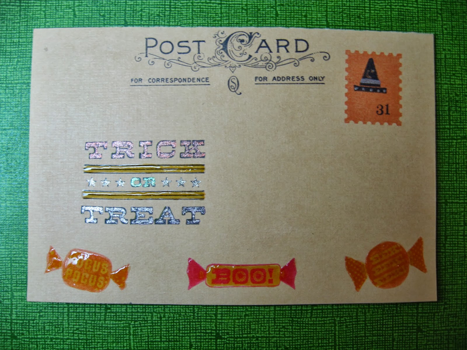
Here are the other two Halloween postcards I did for swap.
This one is done using die-cuts and specialty papers. The crow is a decoration from Martha Stewart's Halloween products. The swirl is a Grunge board die cut that has been painted with Distress Picket Fence paint and then coated with Clear Distress Crackle paint. The tattered roses on the bottom are Tim Holtz Ideaology Trimmings inked with Distress ink.
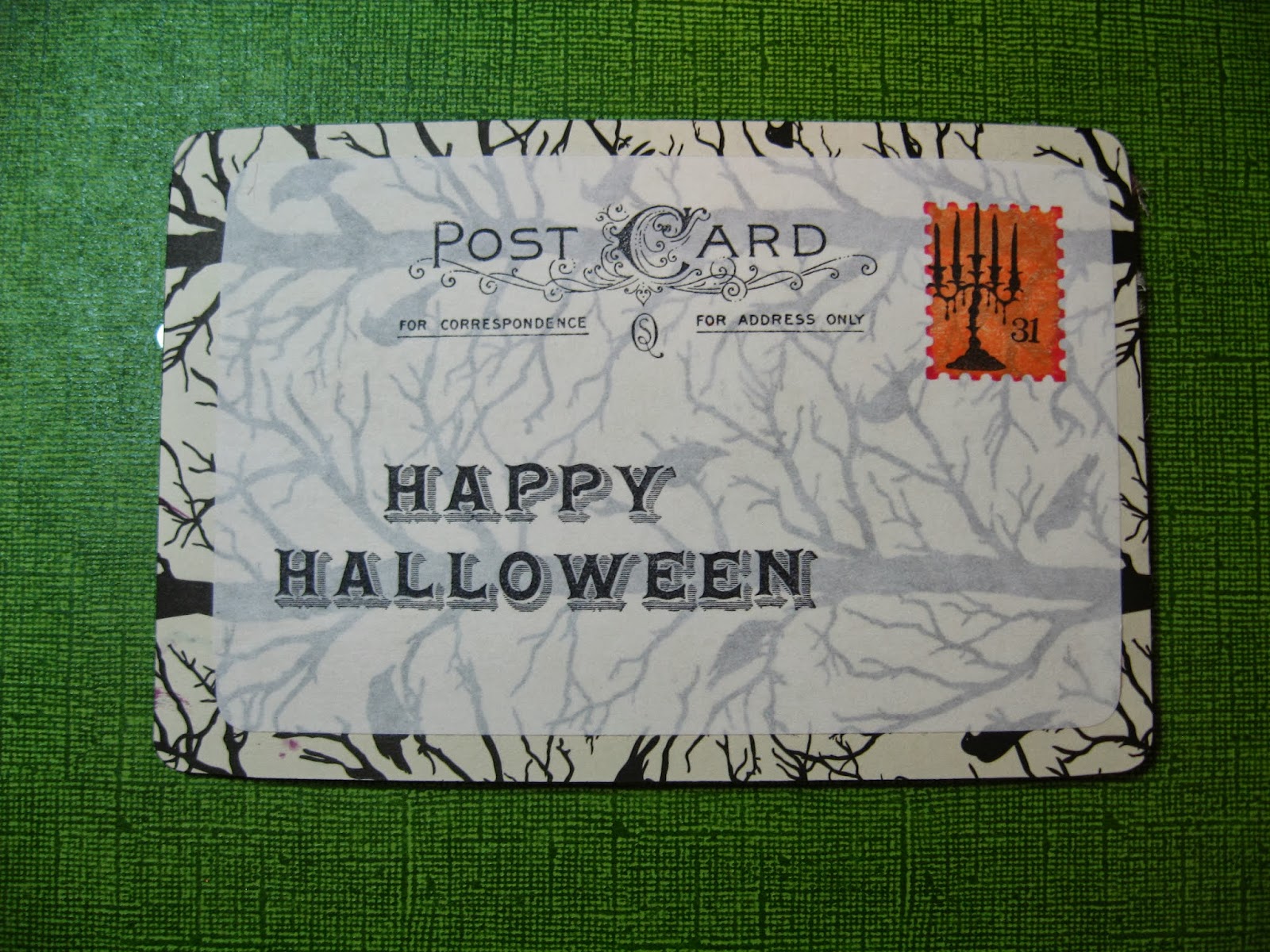
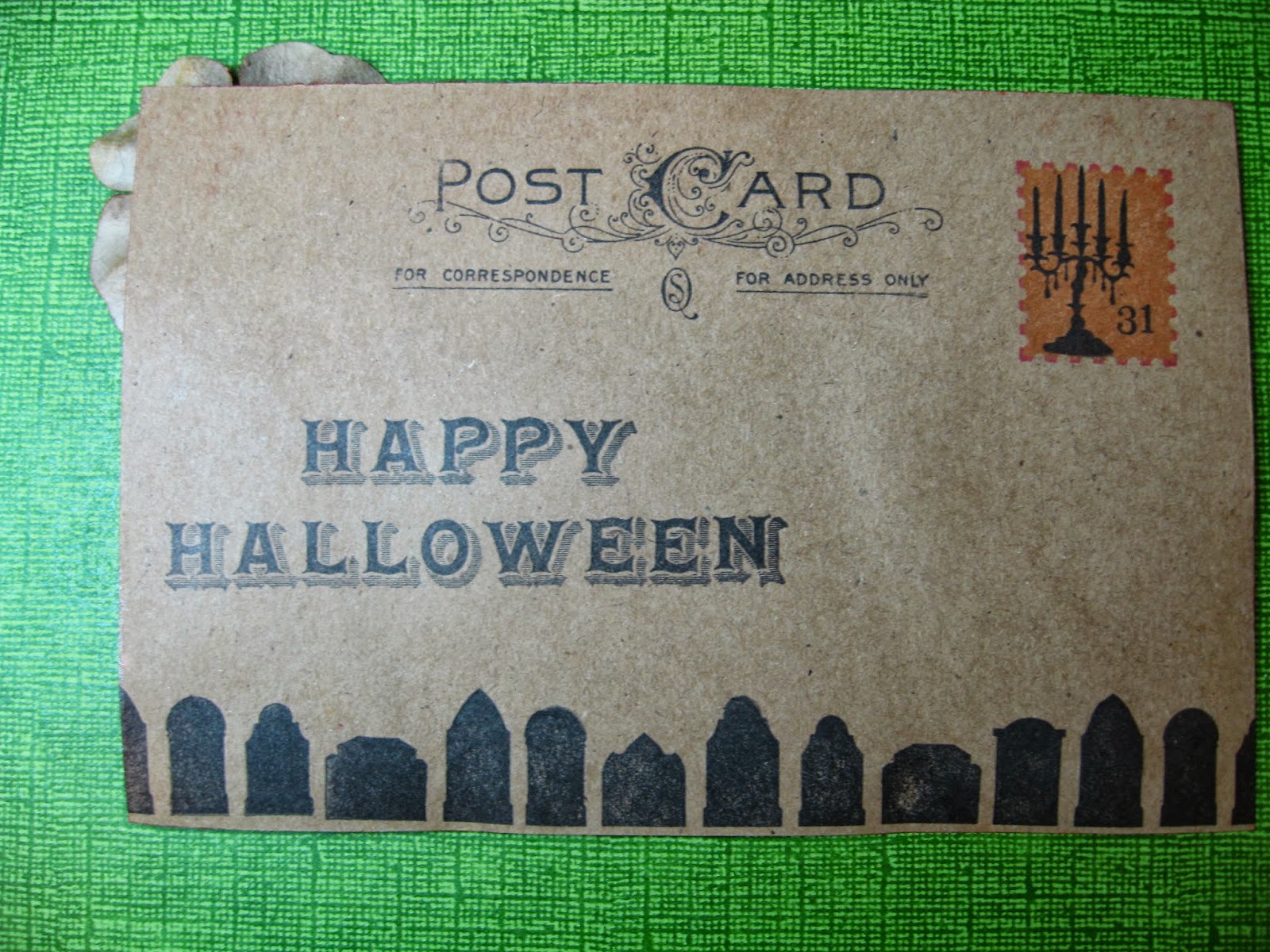
Here is the back of the card:
I stamped the Happy Halloween from Martha Stewart as well as the candelabra. The postage stamp is a shadow stamp from Hero Arts and the "post card" words are the same as used on prior postcard.
My final one for this swap uses lots of techniques including stenciling over a Graphic 45 die-cut frame from Times Nouveau collection with the new Tim Holtz Clockwork stencil, but I came up with one of my own that is going to be my favorite to use I think for a while:
Here is a detail of the decoration in the corner:
I learned some terrific transfer techniques in the Technique Toolbox online class at Big Picture Classes.com from Claudine Hellmuth. It was an excellent class and I highly recommend it if it becomes available again on their website. My transfer technique began based on an idea from that class.
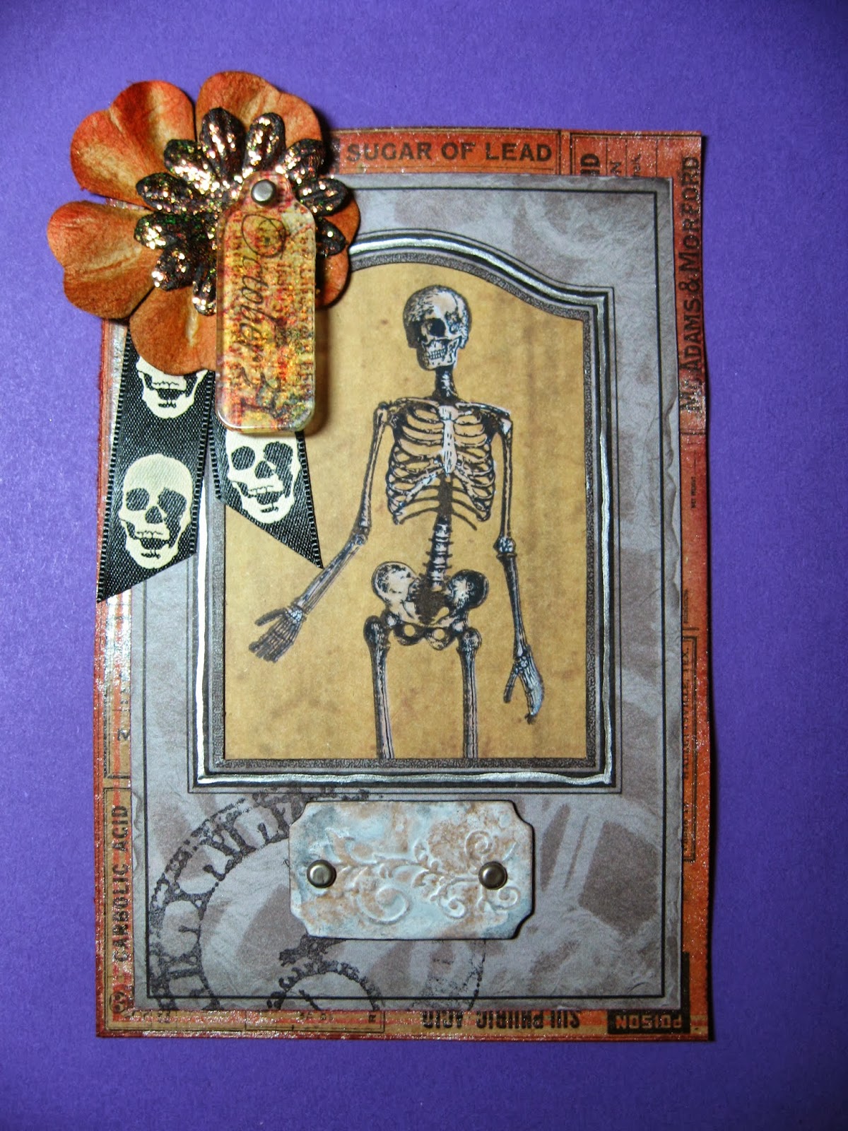
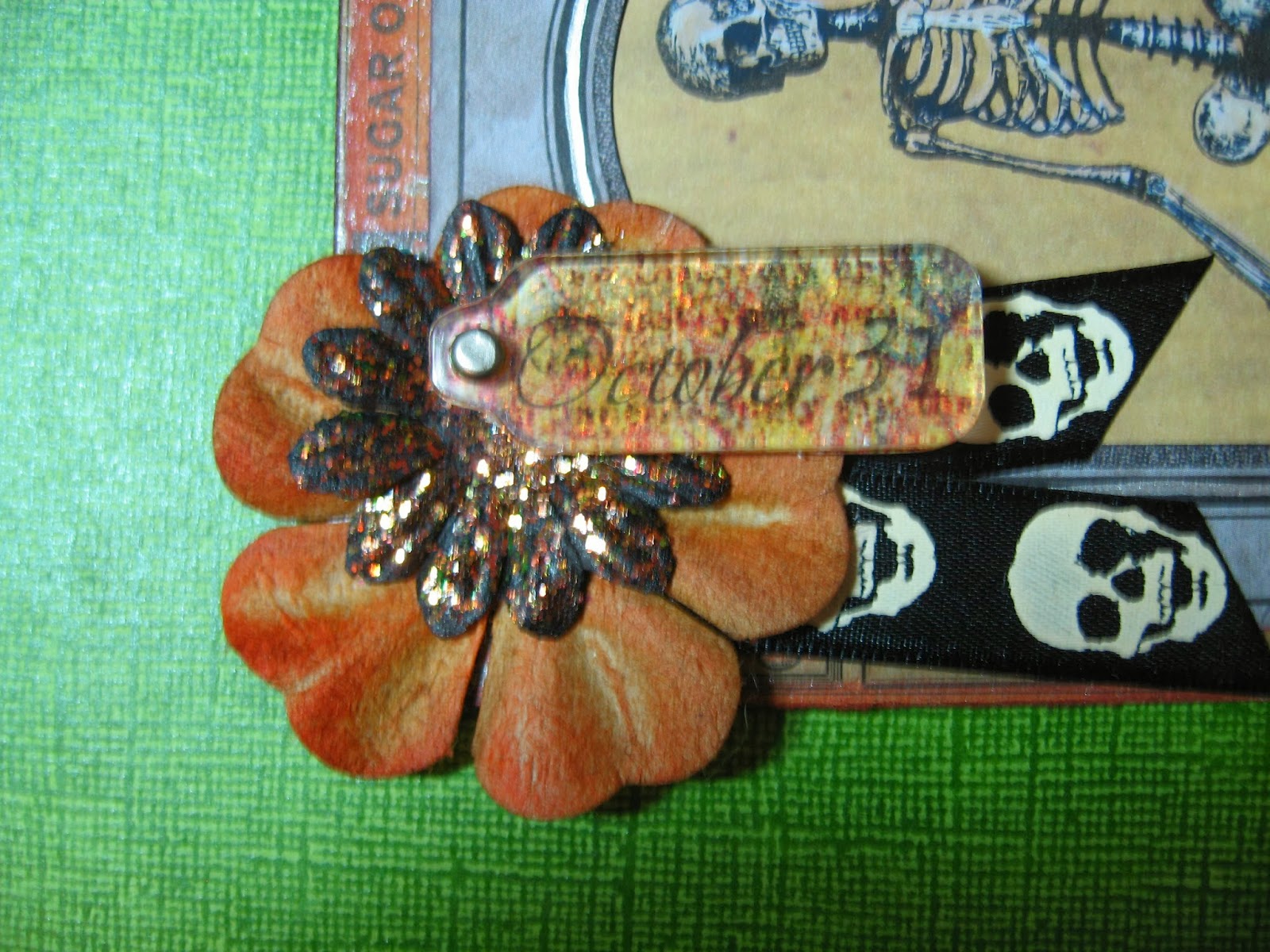
First, I stamped the word "October" and the number 31 onto a pattern scrapbook paper using Ranger Black Archival Ink. I used Glossy Accents to glue down a clear acrylic tag shape from the Idea-ology Fragments line onto the paper. I let this dry. I then used water and my fingers to rub off the paper. This left my stamping and the pattern from the paper on the back of the Fragment. From the front I now had a see-through Fragment that also had a design on it. It looked just fine like that and I could have used that...but, I like things that sparkle.
Years ago, this company Stubby Stampers.com had marvelous events locally where they would show all the latest and greatest products and some terrific new techniques. I am talking before everything was so available everywhere on the internet. They are still in business and have a great online website so check them out.
http://www.stubbystampers.com/ They used to show a technique where you stamp your image with permanent ink onto a clear plastic sheet and use glue and glitter on the reverse side to get some gorgeous glittery images that are smooth on the front.
That idea, plus a paperweight my mother made years ago with Mica underneath a transfer image, gave me the idea to try Stickles glitter glue on the reverse side of my Fragment.
To do this, you have to flip the fragment over so the side you had glued down to the paper is facing you. Spread the Stickles evenly over the entire back of the Fragment. I used Stickles "Icicle". You have to let it dry totally which takes a while (no using heat gun for this.)
Meanwhile, I also coated a black paper flower with the same color Stickles. The larger flower is a kraft color one that I inked with Distress.
Once your Fragment is totally dry, flip it over and admire the sparkles. I tried several different colors of Stickles and find that the lightest colors work best for this. I would stick with Crystal or Icicle if you are going to try it. Sadly, glitter does not photograph very well, but it really looks pretty in person.
Here is the back of my Skeleton postcard:
Give the Sparkly Transfer Technique a try and let me know if you like it! I will be posting some more Halloween items as I have some ATC swaps I have joined as well. Thanks for looking!