Saturday, December 13, 2014

Simon Says Stamp Monday Challenge "Transportation" Entry

 I am so happy to be able to share my creation for the Simon Says Stamp Monday Challenge for the theme Transportation" (2nd week of December 2014). It's my first time at trying something for Simon Says Stamp, so hope it fits the challenge.


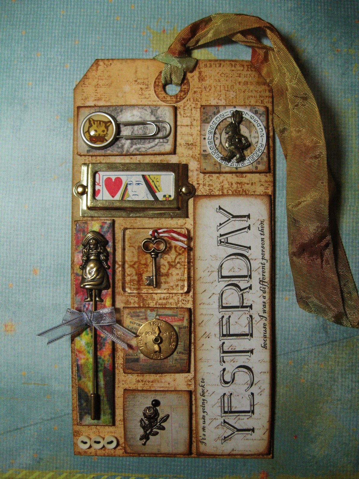
For my focal point, I embossed the car (Sizzix Alterations Texture Trade size) on Core'dinations Kraft-Core paper and sanded it. Sanding flattens the image, so to make it feel raised from the paper, I replaced it into the folder and embossed a second time. I mounted this with brads onto a piece of manila tag that I had done in a background technique from Tim Holtz's blog that uses Washi tapes, Distress Paints, and Distress Inks. For anyone who has wondered what to do with tags they have tried techniques on, but don't really like the whole thing...cutting it up or running it through a die-cut to get a shape out of it for future use is a great way to be able to use that one section of the tag that you actually did like!

I selected my metal file folder tab from the Tim Holtz Idea-ology file tabs set and put it together using the "everyday" word sticker. Then using foam dots, this was placed on top of another piece of the Kraft-Core that had been sanded.

The background paper is from We R Memory Keepers 6 x 6 Anthologie Paper Pad. I cut that paper to size. I used Tim Holtz Stampers Anonymous Shabby Stripes stamp in Lemonade Distress Ink to stamp it four times with the rays going outward from the area I planned to mount my focal point.  I then inked the paper further with Wild Honey, Vintage Photo, and finally Walnut Stain Distress Inks.

I then selected rub-on words from Tim Holtz Idea-ology Remnant Rubs Life quotes to make my own saying for the card, that reads "The Journey is in progress". Along with the word "everyday" on the file tab, it reads "The Journey is in progress, every day." Here is what that background paper looked like before I added my focal point to it.


I attached the focal point to this and adhered this all to a 5 x 7 inch ivory card. Below the background paper, I further used pieces of the manila tag and the sanded blue Kraft-Core in an alternating pattern of varying sizes. I wanted it a little uneven and block-y just because I kind of liked it that way. I then covered the longest edge where the papers meet with tan and black rick rack trim.

Thanks for looking! I had so much fun making my entry and will be trying to participate in more blog challenges in the future.


Saturday, September 6, 2014

A Holiday Tag Swap, Fathers' Day

I joined a new Yahoo group that does swaps and got involved in a holiday tag swap. The way swaps work is you make a certain number of an item (usually one for every participant), mail it to the hostess, the hostess swaps out all the items so that each participant gets one of each person's creations, and mails it back to you. So, I made 12 tags and will be getting back 11 other tags that other people made for the various holidays throughout the 12 months of the year, plus the one I made for myself of course.


The tag is a prepurchased plain white one that I stamped with an argyle pattern stamp and words from Impression Obsession CL92 Masculine set.  I stamped the diamond pattern in China Blue Distress Paint, and then the dotted line pattern over it twice, once in Picket Fence Distress Paint, and then in Chipped Sapphire Distress Paint.  I love how that paint dries opaque and leaves virtually no rough texture to the paper. You run your finger over the paper and you can't feel any rough texture to suggest that paint was applied. The tag and embossed die cut were edged with Vintage Photo Distress ink, the die cut is mounted on pop-dots and I added the argyle ribbon and three Rain Dots under the word "dad".

The goal of the swap was to make tags that someone could use on either a scrapbook page or apply as an embellishment to a card.  I, however, usually like to make a flip booklet of the tags I get to keep them as inspiration for future creating. I also will take them to my local stamping club and show them around.

Thanks for looking at my work!

Friday, August 22, 2014

12 Tags of 2014 May...Catching up

Continuing on making my 12 Tags of 2014, and now up to May. This one took me a while as I was trying to make every item fit in with the theme I picked...Alice in Wonderland. I used the techniques as described on Tim Holtz's blog, but added some details of my own. I didn't have a Shadowpress embossing folder, so once I had the quote from Alice in Wonderland arranged to my liking in a word processing program, I ran a sheet of preprinted paper through my printer. I then glued all the papers and charms I had gathered together onto a tag that I did using the Distress background technique. I used Ranger's Glossy Accents as it works on metal, paper, and plastic as well.


Here are some closeup detail photos.


Love the little cat with a bowtie paperclip I had to make a perfect Cheshire cat.


Here I used three tiny buttons as a detail and sewed them onto the tag with needle and thread.


Finally, here is a closeup of the quote I picked. It reads "It's no use going back to yesterday, because I was a different person then."


Thanks for looking. I hope you like this tag and keep checking back for more I will be making and posting soon.

Sunday, July 20, 2014

An ATC using Tseuneko Ink, Chalks, and Pearl-ex


I did this ATC for my stamp club get together shortly after the Chalkboard technique for February tag.  The theme for swap was cats. I really liked the simplicity of using the Moonlight White Tsuneko ink on black cardstock and then dusting a dry color over it to get whatever color you like to show up against a black background!  If you try just stamping a nonopaque ink onto black, you will see that it just won't show up at all and even some opaque colors don't show up well on black.


I cut black cardstock into 2 1/4 x 3 1/4 inch rectangles because I wanted to diecut them and mount on 2 1/2 x 3 1/4 inch purple cardstock to get the ATC size.  Next I stamped a portion of the block pattern from Tim Holtz Stampers Anonymous Grunge Cirque cling set in Moonlight white.  Using a brush, I dusted some green chalk from a chalk watercolor set over the ink. I let it dry for a minute or two and then rubbed over the image with a piece of flannel just to pick up extra dust and burnish the color down slightly. Using that same method and letting it dry between each step, I stamped the cat (Inkadinkado clear stamps Cat set) in Moonlight White. I used Pearl-ex this time in blue to dust over cat.  I stamped the "You're Purrfect" from a Studio G clear stamp set and then used a gold Pearl-ex to color that.

I then sent the rectangular cardstock through a Cuttlebug and diecut the shape and embossed the edge. Because there was an embossed edge involved, I did not want to diecut first as that might leave a void area where the ink from the image does not completely contact the paper.

My resulting image is a combination of matte (chalk watercolor), and shimmery (Pearl-ex powder) which I think adds some interest to the card.

The little flower decoration is actually three stacked flowers from a jar of Recollections Floral Embellishments. I glued two large flowers and one small one for center.  The center rhinestone is a mini-rhinestone that comes from a nail art pack you can find in almost any drugstore by the nail polishes.  Those little rhinestones are just the right size to add some bling to an ATC.

Thanks for looking at my blog and comments are always appreciated!


Catching Up...March 2014 Tag


This is my tag for the March 12 Tags of 2014 Challenge. I used some of the techniques as on timholtz.com.  I wanted it actually to look a little unfinished, stark, and kind of neglected, as that is what the verse from the Song of Solomon 1:6 means to me. You can't tell it well from the picture, but the stamped image of the woman (I think from Great Impressions) is covered with a piece of idea-ology Frosted Film. That gave it an all-over shimmer, without having to do any coloring. (Did I mention I love color, but really don't like coloring much?)

I first stamped the main image, then masked it so I could use a stencil I cut on my Cricut to make the background, stamp the swirl image and the border (http://www.stubbystampers.com/shopping/stamps/design/borders.html #3581). This made them look like they were behind the stamped image.

Below the border is a scrap of Core'dinations I had left over from another project. It was embossed with embossing folder and then sanded. I tied a piece of cording around the tag. The text is printed out onto a sand-colored cardstock and inked with Corduroy Distress Ink, affixed using Tiny Attachers. The ribbon is the Tim Holtz idea-ology Linen Ribbon that I spread apart and frayed the edges by hand to make them look disarrayed. (Again, on purpose.)

This tag was inspired from a feeling of doing everything for everyone else, while not paying attention to the things I needed to do for myself. Thankfully, since then, I have turned that around.

Wednesday, February 26, 2014

February 12 Tags of 2014, Chalkboard Stamping Technique


Here is my February tag for 12 Tags of 2014. I used similar techniques to those on timholtz.com.  I stenciled my background in three colors of Ranger Distress Inks (Milled Lavender, Seedless Preserves, and Dusty Concord) through the Stripes stencil from the Tim Holtz stampersanonymous.com collection onto a white tag. Once I had finished, it sort of reminded me of the look of pillow ticking fabric.

The saying is Tim Holtz stampersanonymous Phrases 1 set. Rather than using the technique given (since I did not have that particular embossing powder), I tried several different ways of making it look like chalkboard writing.  The one that worked best for me was using Tsukineko Moonlight White Brilliance Ink.

Using that ink, first I stamped image on regular black cardstock. Brilliance is line of fast-drying pigment inks, so I had a brush and my chalk handy. I ran the brush over the chalk to pick up some of the powder and brushed lightly over the ink to avoid smearing. Final step was to let it dry for a minute or two, then burnish lightly with a piece of winter fleece fabric.

A stamping friend of mine had shown me that you can use Versamark ink to stamp, brush Pearl-ex powder over it, and burnish with the fleece to get a metallic looking finish to your stamped image.  So, I thought I would give the same technique a try with Brilliance ink and the chalk powder and I think it worked well for the chalkboard look.

I cut and mounted the saying onto a piece of white cardstock that was colored using the Dusty Concord Distress Ink, then frayed the edges using the Tim Holtz Tonic Studios Paper Distresser.

The stars are Grungeboard coated with glitter using the same technique as on timholtz.com.

I glued two fabric ribbons on bottom of tag and used one of the same ribbons as my tag topper.

Thanks for looking at my tag! Comments are always welcome and appreciated.

Friday, January 31, 2014

12 Tags of 2014, January


Was able to make a tag to participate in the 12 Tags of 2014 on timholtz.com.  My tag uses most of the same techniques as shown on that site. 

I used Idea-ology Mini Mask on large tag for scroll shape seen on top and bottom.

I used rub-ons for the fancy swirl in the upper right corner.

I printed the saying I found on the internet onto Vellum paper and cut out, attaching to tag with Tiny Attacher staples.  Saying is a quote from Mary Pickford (silent film star of years gone by and cofounder of United Artists studio) - "You may have a fresh start any moment you choose. For this thing we call 'failure' is not the falling down, but the staying down."  Thought that was a good thing to remember this new year.

I used a Tim Holtz Sizzix Alterations embossing folder for my ticket shape.  I embossed it on
Grungeboard, cut it out, and then also cut out the area that says Admit One using Exacto knife. I used foil tape on Grungeboard to emboss it a second time, cutting out the Admit One shape and substituting that when I glued tag down.

A tip for detailing: I colored my Tiny Attacher staples with black alcohol ink.