Finally able to finish my March tag, just in time for the next one. I didn't have die cuts that would work for these techniques, so I had to dust off my Cricut mini and use some images from cartridges I had purchased.
A little bit about Cricut Mini:
I originally got the Mini because I thought eventually Cricut would have to go to selling individual data files for a smaller price than the hefty amount of entire cartridges (and I was right!). I wasn't really into die cutting much at the time, but I could see the potential. I don't use it that much, but in cases where I just don't have a die cut shape that works, I've been able to find something on the Cricut Craft Room that I like.
Since I hadn't used it in a while, both the Craft Room software and Adobe Air needed to be updated. That is something to always check for as soon as you have the machine hooked up, turned on, and the Craft Room open. It slipped my mind and cost me about an hour's delay trying to figure out why the images I had selected and put on the mat wouldn't cut. After updating and restarting computer, everything worked fine.
Another tip I have found is if the sticky stuff on your mat is not working 100%, just tape around the edges of your paper with blue painter's tape. It will usually peel off easily. Once I tape it down, I put the mat on a flat surface and rub all over the surface of the paper to try to warm up the sticky mat so paper will adhere. I have done this with success, but also keep an eye on my cutting so if the paper slips I can hit the stop button on screen to quit before anything gets jammed or damaged.
I have seen videos of how to restick your mat, but again don't use it so often that I have ever tried that. For someone who plans on using it alot, investing in the glue remover and sticky spray to restick a mat is probably a good idea.
I definitely think steel rule dies and the other thin dies you can get from other companies are easier to use, less fuss, and don't require extras (like buying new blades and mats). But, the attraction I think of Cricut is how many different images you can get with one single cartridge. I know people who have multiple Cricut machine versions and don't quite get that. I try to conserve space (and money) by really investigating what a machine can do before I purchase.
Now to the tag:
Rather than manila tag material, I cut my bottom layer out of a Tim Holtz cardstock, the middle layer out of a patterned paper and the top layer out of Grunge paper. Since all these will be sealed with a gesso, it did not really have to be out of manila stock. I just was careful to use a small amount of gesso without getting everything soaking wet.
Instead of the cardboard top tag to emmulate a wood surface, I went with cutting a matching layer of tag out of Grunge paper. I changed out the blade in my machine for a Deep Cut blade housing. I taped the Grunge paper down to the mat really well around the edges. Settings for the cut were 5 for pressure, 6 for depth, and 2 (slow) for speed.
 |
| Three layers that will be combined to make one tag. |
 |
| Tag now two layers |
 |
Tag once gessoe and Watercolor Crayons applied. I actually like the way this looked too much to cover it up. So I made a second tag using the same method so I could apply the Grunge board tag over it. I'm saving this one for something else.
|
I had purchased the Distress Crayon Watercolor Kit that is a great buy for what it has. It contains a pack of Distress Watercolor Crayons (6), brush, set of gorgeous clear vinyl stamps, a block for the stamps, Distress Black Soot Archival small ink pad, and two packs of Ranger Watercolor paper. It also has a booklet that shows techniques.
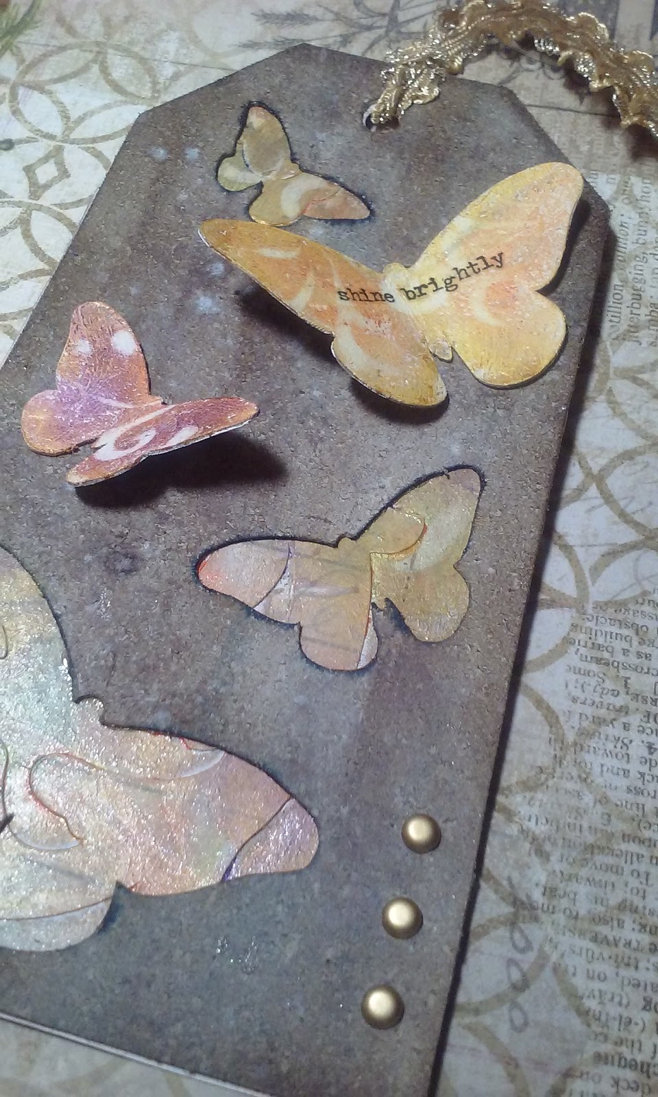
Using one of the techniques within the booklet, I used the butterfly shapes that were cut from Grunge board, coated with white gesso, and smeared with Watercolor Crayon. I then used a Tim Holtz stencil over the butterfly to remove some of the Watercolor Crayon so the white gesso shows through in a pattern. I also decided my background butterflies were a little too dark, so used the same technique on them.
Recollections brand also has Watercolor crayon. Although I like the Ranger colors better, this other brand contains some kind of glimmery additive that leaves a sparkle when dry. I thought that was appropriate for butterflies, so I used both kinds of Watercolor Crayon together.
I used idea-ology rub-on words for the phrase I applied to the butterfly. The two butterflies are attached to the Grunge board surface with Ranger Glossy Accents. Three gold brads and a gold braid finish off the tag.
Thanks for looking at my blog!

 I first made my own stamp layout on a grid block using some various packs of Recollections brand Halloween stamps I had purchased over the years from Michaels craft stores.
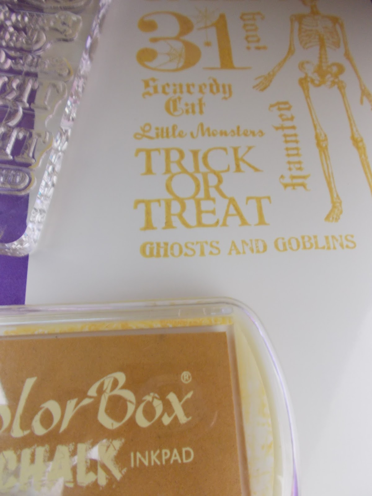 Next, I inked that up with Color Box Chalk Bisque ink and stamped on the Kromekote. For best results I let the chalk ink dry somewhat. Since Kromekote is a treated paper with a very nice, shiny, slick surface, that takes a while.