Friday, February 1, 2019

Online group challenge January 2019

Haven't stamped in a while. Here's a quickly done tag done for an online group.


I used all Tim Holtz products. Melange tissue wrap inked with Distress inks, Distress Oxide through a stencil for the pattern behind the ladies' heads. The word Travel and phrase free to fly are rub-ons. The delightful ladies are from the Paper dolls. Thanks for viewing. Hoping to do more this month and get a little more elaborate.

Thursday, August 11, 2016

Wrapping up Creative Chemistry 103

I knew I was not going to get to try all the wonderful techniques, but was fortunate to get to experiment a little. While I did not have all the supplies as used in class, I did some things with what I did have. One of the techniques looked a little familar to me! I had done something similar to it a few years ago. Here is a picture of a skeleton leaf card I made several years ago using stamps from www.stubbystampers.com


Trying out that technique again was fun, and what would my Creative Chemistry experience be without making something Halloweenie?

The technique I used differs from what was done in class. For my technique, I used Kromekote cardstock (from a stash I have been using gradually for believe it or not 10 years). My inks used are Color Box Fluid Chalk Inkpad in Bisque, and two Ranger alcohol inks in dark colors and Sunshine Yellow alcohol ink.

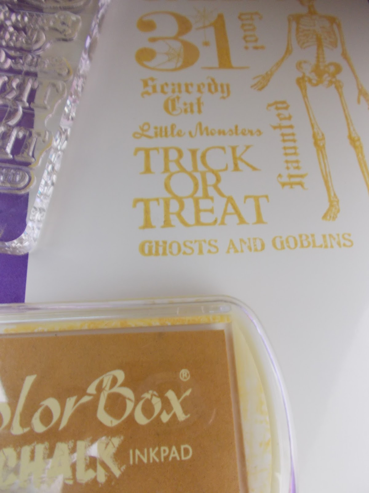
I first made my own stamp layout on a grid block using some various packs of Recollections brand Halloween stamps I had purchased over the years from Michaels craft stores.

Here is a picture of what my stamps all laid out on the grid block looked like.


Next, I inked that up with Color Box Chalk Bisque ink and stamped on the Kromekote. For best results I let the chalk ink dry somewhat. Since Kromekote is a treated paper with a very nice, shiny, slick surface, that takes a while.


When dry as it's going to get, I then applied the two shades of dark alcohol inks in the usual manner using a felt on the ink applicator. As soon as the paper was covered to my liking, I wiped over it with my cloth towel to bring out the images that had been stamped in Clearsnap Color Box Chalk. Normally, the Chalk ink dries with a soft finish. Since it is not soaking into the paper, wiping off defeats that effect, but does keep the paper beneath it from absorbing the colorant from the alcohol inks. I then spla shed a little Sunshine Yellow alcohol ink in areas to kind of colorize the Bisque areas to more of a warm orangy shade. The alcohol ink and blending solution does take a little time to dry on the Kromekote, so I was careful to wait until it looked dry before trimming it to the size I wanted.


I'll probably apply this to a card front and add some embellishments. But, the classroom gallery is closing soon, so I wanted to get at least this part of my experiment posted there.

Thanks for checking out my blog!


Tuesday, August 2, 2016

Creative Chemistry 103 - Day 1

So happy to be taking the 3rd in a series of wonderful classes developed by Tim Holtz, hosted at  Onlinecardclasses.com website.

Chock full of great techniques, even on just day 1, with several days to go. The classes are so well put together with not only PDFs to save or print of all the techniques, but lovely examples by guest artists, with additions like technique labels to print and stick to the back of the example tags we make for each technique. It is a learn at your own pace class, but going on live right now with Tim Holtz answering questions in the forum.

I know I won't be able to do a tag for every technique in just this week. (Raising more sweet foster kittens that are about ready to find homes.) But, I'm sure I'll eventually get to trying each of them out to see where it takes me.

Here's my tag for Day 1:


I used Kraft Resist paper from the Paper Stash collection to cut out my own tag. Using the technique described in class, I used Distress Inks and Distress Pens to stamp out stampers anonymous rubber cling stamps for my design. The great thing about this technique is Distress Ink colors that would not normally show up on a dark background are not only visible, but have a cool kind of extra dimension/depth.

I posted an ATC a while back that used a similar technique, only instead of inks, Pearl-ex and chalk were the colorant to stand out on the dark background. I think I like using the inks better as it is not as time consuming or messy as the Pearl-ex and chalks were both powders.

Off to look at class videos for Day 2!

Thanks for checking out my tag.

Saturday, June 25, 2016

Summer of Creative Chemistry - Week 4 Challenge

The challenge this time was to use Archival ink in your creation. After reviewing the techniques from the original Creative Chemistry 101 class, I decided to do something a little different.


A while back I had made my own stencils using some of the die cuts I had purchased. For this tag, I used the flower shapes I had from cutting Tattered Floral die cut out of stencil material.


I used a tag I had out of my stash of ones I make while trying out different techniques. I learned there is no reason to throw out one you may not like very much, because it can always become a background, under layer, or just die cut a section you do like to use as an embellishment. The technique I had originally used on this particular tag was one from the Distress Crayons Kit I had purchased at Michaels. Above you see the blue flowers that are cut from the stencil material.

I tacked them down to the tag with a little removable double-stick tape to hold them in place. Using Archival Distress Black Soot Ink (also from the Distress Crayons Kit), I then covered the tag with black ink. Using a mask to ink a solid darker color over bright background colors is sometimes called Joseph's Coat technique.


It looked something like the above (pretty ugly), until I then removed the stencil material and...


kind of like magic I have the shapes of the flowers. To bring them more into the foreground of the tag, I used Gellyroll glitter pens to edge around each flower.

I used an Idea-ology Gumdrop as the center for each flower, adheared with Ranger Glossy Accents, and also edged the tag with a see-through ribbon.


Thanks for checking out my blog.

Thursday, June 23, 2016

Summer of Creative Chemistry - Week 3 Challenge

For week 3, students were challenged to make something using Perfect Pearls powders and/or sprays. I did the Perfect Splatter Distress technique which uses Distress Inks with Perfect Pearls powders.

Since every time you do this technique it will be different, I made several tags at the same sitting so I would have a choice of what background to use for my challenge piece.

Here's a picture of the three tags I ended up with:


I had recently gotten some of the newer Distress Inks colors and used Fossilized Amber, Twisted Citron, Mermaid Lagoon, Abandoned Coral, and Wilted Violet along with Heirloom Gold Perfect Pearls on two of the tags, and Blue Patina on the center tag.

Here is a closeup of the Perfect Pearls as it is usually hard to see shiny finishes on computer or phone screens.


Since the backgrounds ended up being so colorful and busy, I decided to add just a few simple additions so as not to take away from all that inky goodness.


Just stamped the phrase from Stampers Anonymous Layering Stamp and Stencil set in Ranger black Archival ink, added a shiny metal dragonfly embellishment on a popdot, silver braided ribbon, and a small strip of the Industrious metal stickers from Tim Holtz idea-ology line.


Thanks for checking out my blog. Now on to week 4.

Wednesday, June 22, 2016

Summer of Creative Chemistry - Week 2 Challenge

The 2nd week challenge was to use Distress Stains. My tag incorporates the marbled stains technique, along with vellum.

Marbled background used the colors Milled Lavender, Dried Marigold, Tarnished Brass, and Picket Fence.


I used some of the Tim Holtz vellum, by coating the back of the vellum with Picket Fence as well. Other colors of Distress Stains will also show through the vellum and change up the color slightly. The Picket Fence on the preprinted vellum just makes the colors already printed on it look brighter.

I tore and crumpled the vellum, gluing to bottom of tag with Claudine Helmuth Studio Extra Time Slow Dry Medium. I also cut out a piece of crumpled vellum with an oval die cut, using the smaller size die cut with regular white cardstock for stamping the butterfly, edged with Rusty Hinge Distress Ink.

I added two sizes of diamond pattern stamps from Tim Holtz Stamper's Anonymous in Milled Lavender and Victorian Velvet Distress Ink to the background to add extra interest.

The ribbon is a Martha Stewart self-stick ribbon from Michael's stores.


Thanks for checking out my tag.

Tuesday, June 7, 2016

Summer of Creative Chemistry- Week 1 Challenge

Tim Holtz is ramping up to a new Creative Chemistry class at OnlineCardClasses.com by adding challenges and information to the prior classes for both new participants and the people who have already taken the classes. How awesome is that!

He issued a challenge to use 4 colors of Distress Inks with some of the techniques in the first week of Creative Chemistry 101 techniques. Here is my tag using Brushless Watercolor Technique, as well as Blended Distress, Spritz and Flick techniques.

Stamps used are from the Stampers Anonymous Tim Holtz Visual Artistry sets of vinyl stamps that were available at Michaels stores.


Thanks for checking out my blog. I'll be trying to keep up with the weekly challenges all summer and am really looking forward to a new Creative Chemistry class in August.